October 12, 2010
by fashionpulse
[Images via Elle.com]
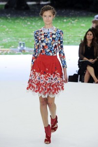
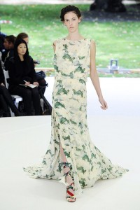
Erdem
After curating the Victoria and Albert Museum’s “Diaghilev and the Golden Age of the Ballets Russes, 1909-1929“ exhibition, Erdem Moralioglu weaved the wispy ethereal nature of ballet costumes right through his collection. Fluid and supple as the movements of the dancers themselves, the lace appliqué and Macbethian red on mini dresses and billowing floral maxis will only ground the designer’s status as the crown prince of delicate details.
[Images via Elle.com]
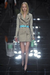
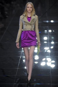
Burberry Prorsum
It’s an art to stray skillfully from the foundation of an established line while still having critics see the history and the connection. Christopher Bailey’s models were hardly the plaid-toting Charlotte Yorks that Thomas Burberry went on to acquire as a fan base. Studded biker pants and fitted jackets made for sexpot pieces that seemed stolen off the set of a 2011 remake of The Avengers. The turquoise belts and lime green bags brought the black pants and tan jackets to life. Color blocking just took on a whole new meaning.

[Images via Elle.com]
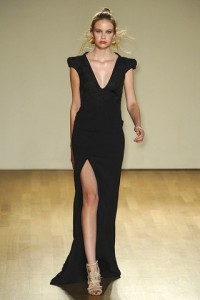
Antonio Berardi
After seasons of body-conscious silhouettes, designer Antonio Berardi pumped up the volume – literally – on his Spring 2011 show and presented charming dresses that had a bit of an edge. Simple bell detailing on slightly voluminous 50s dresses and skirts had a dainty sweetness to them without being sickly sweet. Some unfinished hems brought the modern-fairy-tale quality a bit closer to earth, yet Berardi’s body con fans are never excluded. Elegant floor-length dresses with plunging necklines and daring slits will do the body good.
–Kaci Hamilton
Subscribe to Fashion Pulse Daily’s Newsletter
October 6, 2010
by Julia DiNardo
One of my favorite items of the season, the color list of most popular colors for women, based on the Pantone Color Chart and the New York Fashion Week runway looks is here (via WWD) Which are your favorites for Spring? If you can’t think beyond Fall, here’s a refresher on the chart we posted for Fall 2010 (click here)
-
 1 HONEYSUCKLE PANTONE 18-2120Percentage of designers who used this color: 15.56%
-
 2 REGATTA PANTONE 18-4039
Percentage of designers who used this color: 14.81%
-
 3 CORAL ROSE PANTONE 16-1349
Percentage of designers who used this color: 14.07%
-
 4 BEESWAX PANTONE 14-0941
Percentage of designers who used this color: 13.33%
-
 5 PEAPOD PANTONE 14-6324
Percentage of designers who used this color: 10.375
-
 6 BLUE CURACAO PANTONE 15-4825
Percentage of designers who used this color: 8.15%
-
 7 RUSSET PANTONE 18-1235
Percentage of designers who used this color: 7.41%
-
 8 SILVER PEONY PANTONE 12-1206
Percentage of designers who used this color: 6.67%
-
 9 LAVENDER PANTONE 15-3817
Percentage of designers who used this color: 5.19%
-
 10 SILVER CLOUD PANTONE 15-4502
Percentage of designers who used this color: 4.44%
October 4, 2010
by Julia DiNardo


[Images via Jen Paelmo]
Pamella Roland Spring 2011
The Pamella Roland presentation was a lovely cocktail party at the Whitney Museum of American Art. The mannequins were set up around the perimeter of the space decked out in Pamella’s elegant evening wear or dressed up day wear. My faves were definitely the trench coat that reaches the floor, and the organically stripped one shoulder dress belted at the waist.


G-Star RAW Spring 2011
The star-studded
G-Star RAW show was held in Chelsea Piers this season on Pier 94. The denim line was inspired by the desert with fully functional pieces and fabrics reminiscent of parachute material. The color scheme showed a range of blue, sand, black, and white. I particularly liked the open back cut of pieces in the women’s line and the over-sized hoods. Menswear had great jackets with mandarin/motorcycle collars and new lengths on pants. I noticed the ‘fanny pack’ being brought back in a whole new way – over-sized and actually worn over the ‘fanny’! All in all, a great show to watch and some interesting newness to add to dress casually for spring .
-Jen Paelmo
October 3, 2010
by Julia DiNardo
I spoke with Marco Santini, head hairstylist for ION Studio at the Jeremy Laing SS11 show, about his inspiration for the look. “The hair this season is very conceptual.” He explained that some of Laing’s designs incorporated a head piece reminiscent of a doo rag, so to complement the collection he wanted to mimic a doo rag using only the models’ own hair. The top was made smooth and shiny and came together in the back with a small band of hair cutting across horizontally. To contrast the texture at the top of the head, the models’ own texture was left for the hair to swing underneath the ‘doo rag.’
With simplistic makeup designed by
Hung Vanngo for
Mac Cosmetics, the overall look for hair and makeup was a statement of strength that went along with the designer’s aesthetic. The concentration for the makeup was contoured cheeks, a fresh foundation and washes of color on the lid and over the lips.
It was my first time ever viewing one of Laing’s collections on the runway and I must say I truly loved it! I would honestly wear every piece including the chain-mail-like doo rag. The color palette included a vibrant orange and indigo as strong color statements with black running throughout the collection and a lot of greys and neutrals throughout. What I really enjoyed about the collection was how Laing’s clothes are cut in a way that brought a freshness to flowing layers by combining them with body hugging pieces.
–Jen Paelmo